Art on stage at MADS Theatre
If you read my previous post about my MFA, you'll see it's already pushing me out of my creative comfort zone.
This mindset is probably why I accepted the challenge of painting a nude for the award-winning Macclesfield theatre group MADS. Yes, a nude. And not an abstract one either, one in the style of Lucien Freud.
More specifically, a male nude of a specific person (playing the lead role, and someone I knew), wearing a Port Vale hat, with a bloody bandage wrapped around his foot.
The painting was to be revealed at the end of the company's production of Ugly Duck by Deborah McAndrew. The play is about a young Stoke-based artist who wants to paint a 'real working man' in the style of Lucien Freud. Enter Port Vale fan Dennis, who is unemployed in the wake of Stoke's declining pottery industry. It's a play about risking it all for art, for what you love, following your bliss and unlikely alliances.
When the team discovered I was a painter, so they asked: Could I do it?
While I'm an abstract artist these days, I used to do a lot of life drawing and figurative painting (see below), but it had been a long time.
But it was a creative challenge, and I do love me one of those. So, I researched Freud and his process, refreshed a few of my nude and portraiture techniques, and accepted said challenge.
I've outlined it below if you'd like to read more about my process.
Can't wait to see how it ended it up? Scroll to the end for a close up.
Sherry at Four, J R Oatts, 2014

The process
1. BRIEF & RESEARCH
I met with the play's director and head of props to talk about what they wanted. I showed them a few of my old figurative works and took examples of Lucien Freud's paintings to discuss. This was important as Freud's style varied a bit throughout his life - just take a look here.
But it turned out Benefits Supervisor Sleeping is the Freud work mentioned in the play, so that's the style they were going for. This pleased me greatly, as while it's a very detailed piece, the brushstrokes are pretty loose, which worked well with how I paint. I'm certainly no photorealist!

We discussed various aspects of the painting, like composition, size, cost, timelines, materials, background, and what details need to be included, like the fabric on the chair, the bloody bandage on his foot – mentioned in the script – and the Port Vale hat. A few days later, the MADS team sent photos of the actor playing 'Dennis' in the agreed pose, both clothed and nude, and of the chair and the hat in detail so I could get to work. I had two and a half weeks, but other projects and commitments were ongoing, so I had to get organised.

I also did some research into Freud's palette. While it's evident that he painted with very few colours, many suggested that he used a variant of The Zorn Palette to create his earthly, natural skin tones.
I didn't know much about the Zorn palette. But to make it look like a Freud painting as much as possible, it made sense to me to try and emulate this, so I decided to give it a go.
You can read more about the Zorn palette here on the Jackson's Art blog, but essentially, it means using just four colours: Yellow Ochre, Cadmium Red, Mars Black, & Titanium White, carefully mixing them to create all the colours you might need. And it works really well for skin tones.
I chose Golden Heavy Body Acrylics (above), as they are high quality and dry quickly so that they can be layered easily, which I figured would work well for this. What I do know about painting nudes is our skin tone is made up of many, many colours and tones, so layering - as Freud was a fan of - is a great way to capture the qualities of skin and make it look, well, like skin.
2. COMPOSITION
After quite a lot of sketching on my iPad and in pencil, I landed on a composition I liked, which I sent off to the team to approve.
At this stage, I wasn't so much worried about a likeness as I was trying to understand the model's body in space and on the chair, how the hat sat on the head, and where the angles of the body would be – and whether that was the position of 'Dennis' they were after.


3. DRAWING
With the composition approved, I thought about transferring the drawing on to the canvas. There are many ways to do this, but I opted for the tried-and-tested grid method. This allows for a bit of freehand when the drawing is transferred onto the canvas – so you can add a bit of expression to the lines you're drawing – while still keeping the proportions right.
For those who've never done this, it means tracing the sketch and creating a grid on on top (see above) Then replicating that same grid on the canvas - larger, but with the same proportions and aspect ratio – then replicating the lines of the figure – square by square, onto the canvas.
So, no matter what size your painting, it will closely represent your original drawing. If find it best to keep the traced drawing fairly simple and not transfer too much detail over to the canvas drawing as the lines and details could disappear easily as you paint them.


Ideally, you need to draw straight onto the canvas with paint, which I might normally do if I didn't need so much of a 'likeness', but in this instance I knew pencil or charcoal would be better. So I used a technique combining Vine Charcoal and Raw Umber.
This allows you to draw the grid and the drawing on the canvas with the freedom of charcoal, then paint over the drawing with Raw Umber (you can use other earth tones), which fixes the charcoal. Vine charcoal - rather than Willow Charcoal - mixes well with the Raw Umber without making the canvas smudgy (as it would with Willow Charcoal). Thanks to this YouTuber for a reminder on how to do this! When the paint is dry you can erase the extraneous charcoal gird around the figure with decent hard rubber, leaving your Raw Umber/Charcoal figurative drawing intact.
I used Jackson's Vine Charcoal sticks and Golden Raw Umber to do this. Really annoyed I didn't do a photo of this stage. But I was concentrating more on getting it right to be honest! Drawing finished, I was pleased with the way things were going.
It was not all plane sailing though. The proportions took a bit of fiddling with. I went too thick with one of the painted lines around the head, which altered the distance from the head (bent down) to the end of the bandaged foot (flexed and in the foreground). This had to be just right to make it work as a three-dimensional shape or it would look too 'flat'. I could hear my A-level art teacher, Mr Harrup (RIP), saying: "Remember, the head needs to be a 6th of the full body length." So that kept me focused!
When the drawing was done, I blocked in the background with Burnt Umber. It has a nice warm feel and can look very dark and more rust-toned in places, which creates a bit of interest in the painting and give a sense of 'a background'. The MADS crew had agreed the background would be neutral, and the painting needs to look a little 'unfinished' so that felt like a good way to go.

4. TONAL PAINTING & BACKGROUND

In my research, I'd read that creating a tonal painting with Raw Umber and Titanium White would give the figure a 3D 'lift' underneath the top colour layer. It would also mean less colour would be needed on the top, as the shadows and highlight would already be there in the tonal painting.
At the end of the tonal painting, I felt like a real person was 'coming to life'.
Although that person currently looked more like a marble statue, and the face wasn't quite right. But I was confident I could fix that at the next stage when I started adding the colour.
5. THE ZORN PALETTE

Sent a photo update, and again, the MADS team were all happy with the progress.
Mixing with the Zorn palette was surprisingly easy once I got started with it. What's good about it is that, because of the tonal painting, I had a guide to follow on what tones would work. I also only need to add a little colour to bring it to life.
I did this in stages, focusing on the dark tones, mid tones, and light tones and then the shadows and highlights (in that order).
Again, I made a few errors that had to be fixed. A little too much lighter colour in one place or another meant I lost muscle definition on some limbs, which then had to be brought back in. A wrong stroke on the hat and it looked to much like a swimming cap! I added too much midtone to the fabric, which knocks out the dark shadows and highlights, losing the 3D quality. But I stayed focused!
If you're going to use the Zorn palette, one thing is that once you're happy with the colours, mix enough of them to do the whole painting in one sitting. I didn't in some cases, so I had to remix in another session, and it's very hard to match exactly, as each tone is relative to the other four colours you've mixed.
It was confirmed we were going with some blood on the bandage (which was in debate when I first got the brief) as it's referenced in script, so I was very careful to just add a few drops but not too much, as a I knew red would really draw the eye to that part of the canvas.
I also left the detail of the face until the end, as I knew that would take the longest and be the area I would end up fiddling with the most.
There was no pressure to make an exact likeness of actor Chris, but I wanted to get it as near as possible (call it 'professional pride'!) So I spent a lot of time getting facial proportions and shadows as best I could with the angle of his head, the way his eyes were downcast but not closed, and the way the hat was sitting on his head.
At one point, I paused. Stepped back. And 'Dennis' appeared to me.
I asked my partner Mark to come in and give me a second opinion.
Was I finished?
He agreed; there was no more to be done. Brushes down!!!

I was very nervous on delivery day, but the cast and crew were thrilled with the results. I also got to see the programme for the first time, where MADS had let me have a full-page ad, which was great.


7. MY FIRST THEATRE REVIEW!
On the night I went to see the show, the piece got audible gasps when the painting was revealed at the end of the play.
This was apparently repeated each night of the 3-night run! The painting and my name even appeared in reviews for the play, including this one below, so I was dead chuffed. Link to full review here.

Not many times do artists hear collective audible gasps at their work (in a good way!), so it was a really special moment. Particularly since the play is all about putting yourself out there, taking risks, and the human need to make art.
There may have been tears.


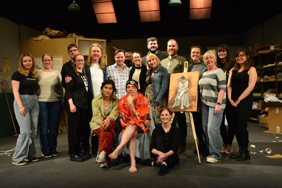
Thanks to Hilary Ogden, head of props and director Gemma Wilson (above far left) and not least, 'Dennis', played by Chris Allies (above left), for the great experience, and to Ellaika Villegas (next to me, above right) for playing the role of 'the artist' so well – it was great to meet her for the first time at the after show party.
Oh and I also loaned a few older pieces to the crew as props for the set. It was an interesting experience seeing my old work 'on stage' for 2 hours. Check out the rainbow painting, and my LAOTY picture of Hever Castle in the background!


So, am I going to be doing more portraits in the future?
It was definitely a challenging and rewarding process. It's great to know that skill is still available to me. So let's see.
The biggest lessons (or relearning) for me were:
- Say YES to things, even when you're not 100% sure you're up to it
- Planning is everything
- Proportions are everything when it comes to the human form
- When there is a tried and tested process in place, trust it!
- The Zorn palette is amazing! It's making me wonder why I need the trillions of paint colours I have currently.
- Don't be afraid to try something new. It might turn out better than you ever expected.
But, I'm not going to lie, I am looking forward to getting back to colour!
As for what happens to the 'Dennis' painting now, the cast and crew have all signed the painting around the edge (head of props Hilary making her mark below left), and as it stands, is just getting its varnish on.
When it finds its final hanging space, I will update you!


Thanks again to the crew and cast at MADS for the experience. Check out the company's next productions here: madstheatre.org
Credit: All on stage at MADS Theatre images - Sam Si Theatre Photography